International cartography is rarely just about drawing lines on paper. Maps dictate geopolitical realities, shape national sovereignty claims, and trigger diplomatic storms overnight. When a freshly circulated United Nations map featured jarring errors regarding Arunachal Pradesh and Aksai Chin, New Delhi didn't stay silent.
The diplomatic machinery moved fast. Foreign ministry officials pointed out critical anomalies in the graphic representation, which bizarrely isolated crucial border territories instead of recognizing them as part of India. If you think a simple map error is just a minor clerical glitch in an international office, you're missing how global bodies shape territorial perception.
What Went Wrong with the New UN Cartography
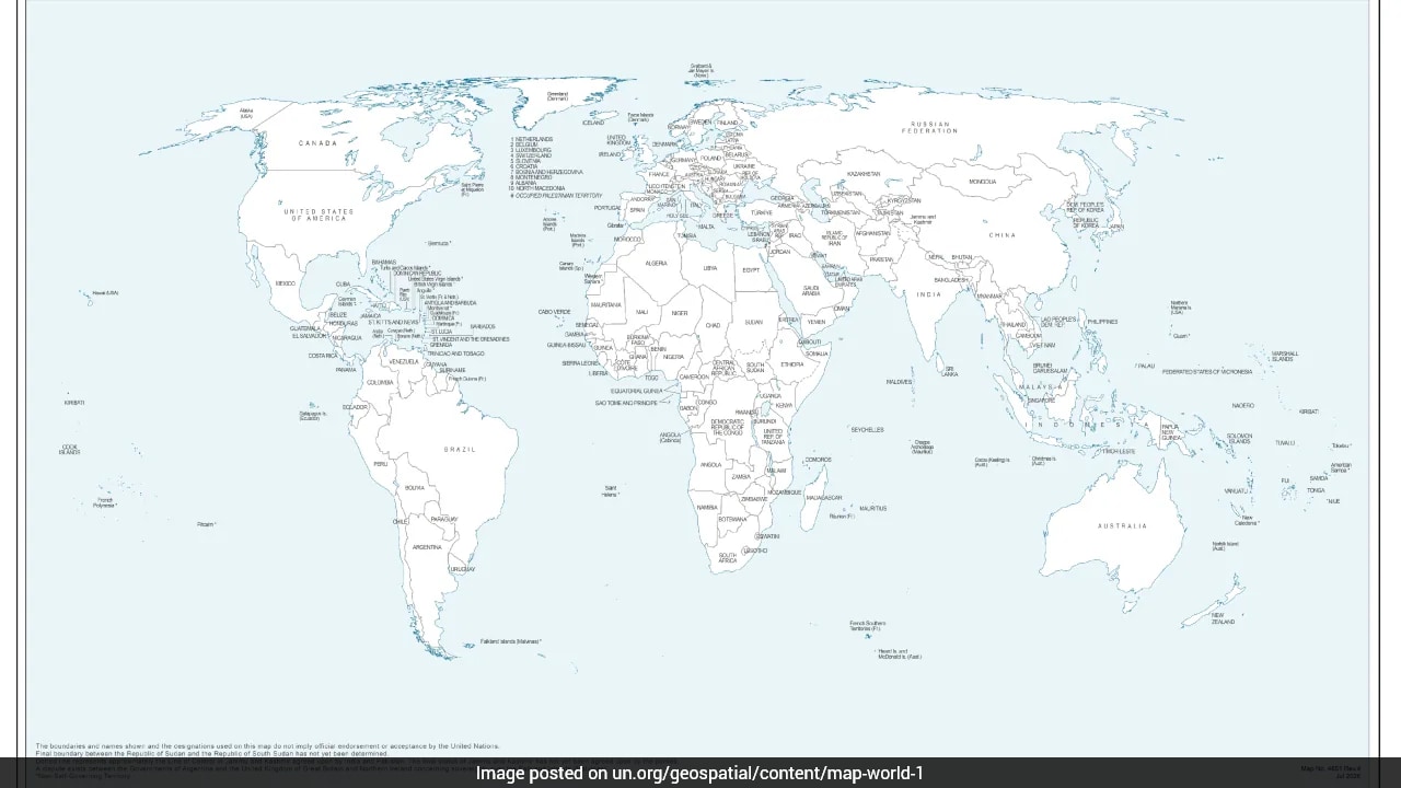
The trouble started when a newly minted map surfaced during discussions surrounding a recent UN General Assembly resolution. Instead of following established global boundaries, the graphic depicted Arunachal Pradesh as an independent region sitting between Assam and China. Even worse, it completely erased vital state borders like the one shared with Nagaland.
Aksai Chin didn't fare any better. The map rendered it as a detached territory flanked by India and China.
New Delhi's response was swift and uncompromising. Ministry of External Affairs spokesperson Randhir Jaiswal made it clear that India's vote in favor of the UNGA resolution—which centered on promoting equal-area maps like the Equal Earth projection rather than traditional Mercator distortions—did not equal an endorsement of any flawed visual layout. India maintains that Jammu, Kashmir, Ladakh, and Arunachal Pradesh are entirely inalienable parts of its sovereign territory.
The Real Agenda Behind Equal-Area Maps
To understand why this map exists, you have to look past the border errors to the underlying cartographic shift. The UN General Assembly adopted an African Union-backed resolution titled "Correct the Map."
Traditional world maps rely heavily on the 1569 Mercator projection. It's great for sailors plotting straight compass lines, but it severely distorts landmass sizes. Countries far from the equator look massive, while landmasses near it appear shrunk.
The push for equal-area maps aims to fix these geographic proportions. Africa and other equatorial regions finally get represented accurately by size.
Yet, changing how the world visualizes geography opens the door for careless errors or backchannel attempts by external parties to shift long-standing boundaries. When multilateral institutions roll out new digital templates, local boundary definitions get mangled if technical teams fail to consult sovereign governments.
Why Border Depictions Matter in Multilateral Diplomacy
Cartography at the global level carries legal and psychological weight. International organizations shape textbooks, global databases, and regional planning tools used by corporations and governments alike.
If a major multilateral body accidentally or intentionally misrepresents a nation's borders on an official document, foreign entities can cite those maps to contest sovereignty. That's why New Delhi takes every single line, dotted border, and footnote so seriously.
India's prompt objection serves as a reminder to international secretariats that territorial integrity isn't up for debate or casual redesign by external cartographers. The anomalies have been formally taken up with the relevant offices, and New Delhi expects corrections.
Check your sources, monitor how global bodies implement digital spatial databases, and don't assume technical updates are politically neutral.