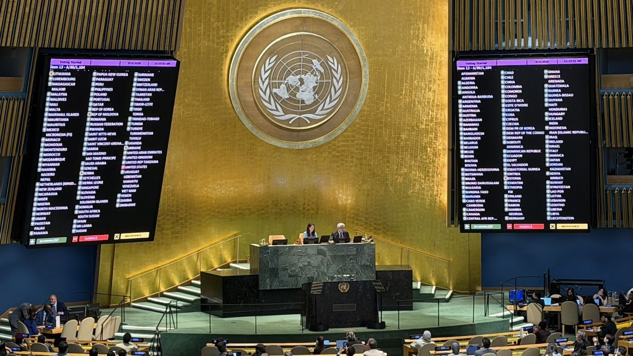
We have all looked at world maps in classrooms for decades and assumed they were objective windows into reality. They aren't. Every flat map of our round planet requires distortion, but some distortions carry a heavy political and psychological weight. When the United Nations General Assembly adopted the "Correct the Map" resolution, it exposed a glaring visual imbalance that has shrunk Africa in the global consciousness for over four hundred years.
A total of 164 countries voted in favor of the initiative led by Togo on behalf of the African Group. The United States stood alone as the lone dissenting vote, while six nations abstained. This move isn't just about lines on paper. It centers on how geographic proportions shape economic and political influence.
The Mercator Problem
To understand why this vote matters, look at standard geography textbooks. Most classrooms rely on the Mercator projection, designed by Flemish cartographer Gerardus Mercator back in 1569. It was built for one specific purpose: helping sailors navigate oceans using straight compass lines.
It does that job well. However, it comes with a massive geometric penalty. To flatten a sphere onto a 2D sheet, Mercator stretched landmasses as they moved away from the equator.
The result? Regions near the poles balloon in size, while areas near the equator are squished down. On a traditional Mercator map, Greenland looks roughly equal in size to Africa. In reality, Africa is roughly fourteen times larger than Greenland. That visual distortion affects other equatorial regions too, making North America, Europe, and Russia look monstrously huge compared to their actual land area.
Shifting to Equal Earth
The recent UN resolution champions alternatives like the 2018 Equal Earth projection. Developed by modern cartographers trying to fix historical biases, Equal Earth preserves the actual relative proportions of the world's landmasses.
When you view the world through this lens, Africa expands dramatically to its true scale. South America and India also reclaim their proper visual weight.
Geographers and African Union advocates have argued for years that maps dictate perception. When children grow up seeing a continent that houses over a billion people shrunk down to look like a minor landmass, it creates an invisible bias. Cartography carries authority. People trust maps implicitly, rarely questioning the math behind the projection.
Why the US Said No
Washington's opposition to the resolution raised eyebrows globally, though it aligns with predictable diplomatic friction over cultural and historical symbols at international bodies. The US mission dismissed the debate as a distraction from pressing security and economic crises, criticizing the focus on 16th-century cartography.
Yet, the overwhelming 164-1 vote shows that the rest of the world sees value in updating our global imagery. Non-binding UN resolutions don't force immediate legal changes overnight, but they shift institutional habits. Organizations like the World Bank have already begun phasing out Mercator for digital mapping where accurate data visualization matters.
Check the maps you use in your daily work, your software, or your children's learning materials. Shift your perspective toward equal-area projections when scale matters. Stop accepting outdated cartography as objective truth.